Christmas Couple Illustration I was asked to create this caricature to be included in a Christmas ornament and as an art piece for the client’s home. I used Illustrator and the provided reference images (see below) to create these images. The idea was to make the same image for the ornament and the art piece but they wanted the ornament to include Santa hats. The client wanted to use one image as a pose and outfit reference but liked their hair in the other photo. Pose and outfit reference Hair reference
Conversations with the President
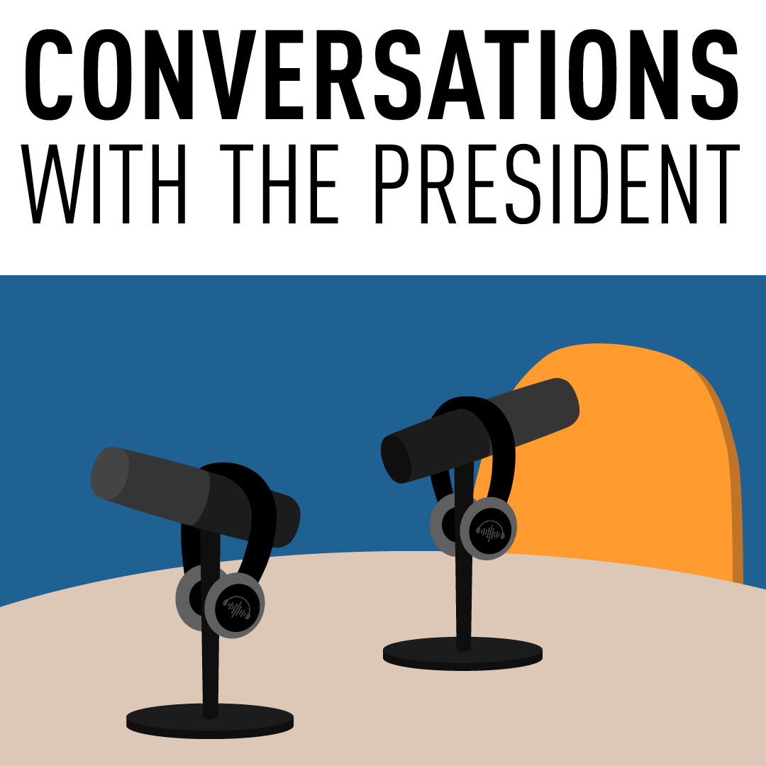
Conversations with the President Podcast Promotional Design Conversations with the President is a podcast series that appears on the Canadian Bar Association’s English podcast channel: The Every Lawyer. The promotional material for this started with the basic concept of a conversation between two people. The above concept was created but it was decided it would be nice to have the host in the image because they are the consistently there in each episode while the topics and guests change between episodes. Below is the progress of photos created for Ray Adlington, who was the first president to host this series (2018-2019). First design Second design Final design The chosen concept was as minimal as possible while still keeping the host recognizable. We wanted to make sure his mouth was drawn to focus on the conversation he will be having with his guests. With the concept for the promotion material already created the year before, it was easy to recreate the same design but with a new host, Vivene Salmon (2019-2020).
Climb Club
Climb Club logo T-Shirt Design T-shirts created for a hobby-bouldering group. They wanted a small logo for the front of the shirt and the back to look like an eye exam but with the word “climb” repeated. The eye exam chart was simple to create. I found a font that looked like the font used in an eye exam and then I repeated the word climb club getting smaller with each new line. For the logo on the front, I had two design ideas. The first idea was to find a font that looked like rocks and add silhouettes of people bouldering off of them. The second idea I had was a simple more minimalistic design. For this one, I used a skinny sans serif font with a silhouette of a boulderer climbing to the side of the text. The following are close-ups of the designs I created. Back design Rock font design Minimalistic design The group liked the minimalistic design more than the block design. I used a Cricut to print and iron on the designs to the shirts for the team. One member wanted to have both designs so I created an extra one in the block font design.
There’s No Place Like Foam
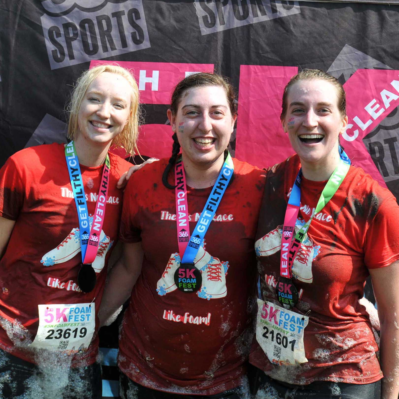
There’s No Place Like Foam T-Shirt Design I created these t-shirts for my team when we participated in the 5K Foam Fest in 2017. Our team name was There s No Place Like Foam which was a play on the Wizard of Oz quote “There is no place like home.” Because we went with that theme for our name I wanted to relate our shirts in the same way. I went to running shows and some bubbles on red shirts. I worked in Adobe Illustrator to create the graphic. I went through a few phases testing out the text layout as well as the number of bubbles for the foam. The next step was to print out the design on iron-on paper before ironing the design onto the shirts. Everyone liked the shirts and we had a fun time participating in the race. Design iteration 1 Design iteration 2 Design iteration 3 Design iteration 4 Final design Design cutouts being placed on the shirt to be ironed Design ironed on shirt Finished shirts hanging up
Happy Holidays
Happy Holidays Social Media Animation A simple animation I created for the Canadian Bar Association to wish their social media followers, Happy Holidays. I created it in 2018 using Adobe After Effects. Because the Canadian Bar Association is a bilingual organization, I made sure the animation would transition seamlessly between English and French. I chose a script font and created the animation to make it appear as if the text is being written out by hand instead of typed. I provided two background colours to allow some versatility if the animation was used multiple times or in future years.
Echo
Echo The Anxiety App Echo is an anxiety app created for staff and students at Algonquin College. The name of the app was inspired by the name of a therapy dog owned by a student at Algonquin College. This project started in the summer of 2014 and took a year to create. Echo was created using PhoneGap by myself and a colleague at Algonquin College. We started by creating a mock-up of the possible path the user would take to navigate between the different pages on the app. Once that was decided we both worked on the code using HTML and CSS that would be exported for Apple and Android devices through PhoneGap. I created the graphics in the app and went through the process of submitting the app to iTunes. We talked with the client a lot about what type of activities would be in the app and what the layout of the app would be. Once this was decided, we worked on creating each individual page and making sure it was what the client wanted.
Advancing Learning
Advancing Learning Conference 2015 Advancing Learning is an instructional technology conference that is hosted by a college in Ontario each year. In 2015, Algonquin College was chosen to be the host of the conference. I was a member of the marketing and communication teams for this conference. Being part of these teams meant I was responsible for creating printed material for the conference (badges, posters, etc.), building the website, and helping with social media aspects of the conference. I worked on the website by using WordPress, HTML, and CSS to edit the pages. I also used PHP to create a custom WordPress widget. The badges were created using Adobe Illustrator CC. They went through many variations before the final design was decided. The following are some of the different stages the badges went through. The committee wanted to find a way to add stickers to the badges to encourage engagement between participants. Our solution was to add blank circles on their name badges that were the same size as the stickers to show where they could be placed. Previous Next The final badges had four different looks – participant, sponsor, volunteer, and speaker. The circles for the stickers were taken off because the committee thought it would be best to allow the participants to place the stickers anywhere on their badges. The final design piece I created was a poster of the agenda for the conference. They were printed out and placed throughout the campus for quick view. Speaker Badge Sponsor Badge Volunteer Badge Participant Badge
Dactivity Posters
Dactivity Posters For Algonquin College These posters were created for Algonquin College’s Digital Activity (Dactivity) system. They were designed to go on a display with two square windows side-by-side. I used Adobe Illustrator CS6 to create these posters. I took screenshots of the different activities available on Dactivity. I created vector-style images of students using the system while keeping with Algonquin’s branding. I used circles and lines to encourage the viewer’s eye to take in all the information that is on display.
BYOD Information Cards
BYOD Information Cards For Algonquin College At Algonquin College, most of the courses are part of Bring Your Own Device (BYOD) program. These info cards were created to give to staff and students a quick glance at what this program provides for them. It also directs them to get more information by visiting the website or by sending an email. I made sure the cards matched Algonquin’s branding and I used provided text that I modified to fit on the business cards. The following images are older versions of the same cards. All the cards were created using Adobe Illustrator CC. FrontBack FrontBack FrontBack