T-shirts created for a hobby-bouldering group. They wanted a small logo for the front of the shirt and the back to look like an eye exam but with the word “climb” repeated.
The eye exam chart was simple to create. I found a font that looked like the font used in an eye exam and then I repeated the word climb club getting smaller with each new line.
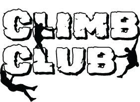
For the logo on the front, I had two design ideas. The first idea was to find a font that looked like rocks and add silhouettes of people bouldering off of them. The second idea I had was a simple more minimalistic design. For this one, I used a skinny sans serif font with a silhouette of a boulderer climbing to the side of the text.
The following are close-ups of the designs I created.
Back design
Rock font design
Minimalistic design
The group liked the minimalistic design more than the block design. I used a Cricut to print and iron on the designs to the shirts for the team. One member wanted to have both designs so I created an extra one in the block font design.
Contact Me
I'm a Multimedia Developer. I problem solve with creativity!