Every year, the Canadian Bar Association (CBA) holds essay contests for law students. The old branding was themed around coffee with the slogan “Caffeinate your Career.”
At the end of 2019, they wanted to update the branding. I worked alongside one of my coworkers come up with the general theme and look we wanted the rebrand to include. We knew we wanted to create something animated since most of the promotion would be done through social media where video does better than a static image.
We first came up with the concept of a pen writing across the screen. We thought this was a simple way to represent essay writing. We received feedback that there may be a disconnect since most students write essays on their laptops.
We went back to the drawing board and came across the below image on iStock. We thought it would work well to animate while portraying the idea of essay writing.
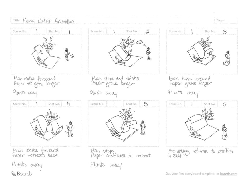
Since we were on a time crunch, we didn’t have time to create our graphic from scratch and animate it in time to start promoting. We decided to show the image we found on iStock to get the approval to purchase the it. I created a storyboard to show how the animation would move to back our idea before purchasing the image.
Storyboard
Once we got the approval, I purchased the image and started working with the image in Adobe Illustrator. To make it animate, I had to make sure all the moving parts were on separate layers before importing them to Adobe After Effects. I also had to edit some of the colours to make them fit with the CBA’s branding. Once I was finished working in Illustrator, I made sure all the joints were in the proper parenting hierarchy.
Next, it was finally time to start animating. I started with the plants because they were the least complex part to animate. I made them sway slightly and made sure the animation would loop seamlessly before moving on to the thinking man. I originally had the idea to make him walk but thought it would be too much. Instead, I changed it to him looking down at his book, tapping his foot then looking up again. Once I was happy with this animation and it looped correctly, I animated the thinking bubble above his head.
Finally, it was time to work on the main animation – the paper. I wanted to make it look like a receipt being printed. Each hump is an individual object in the file. I used a clipping mask to make the paper appear as it is unraveled, but I also used a clipping mask to make the text on the paper appear to be moving over each hump properly.
The next year (2020), I were asked if I could change the colours to freshen up the branding once again.
2019 Version
2020 Version
Contact Me
I'm a Multimedia Developer. I problem solve with creativity!